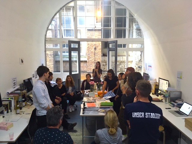
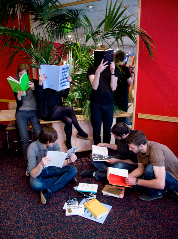
Mathias visited us today with his students from Eracom, Switzerland, to discuss books around a drink.
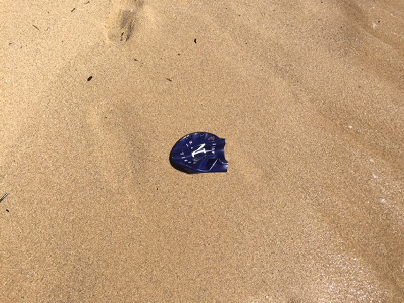
Trying out our Memo for Nemo swimcap (and book launch invitation) in the Atlantic Ocean.
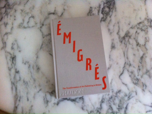
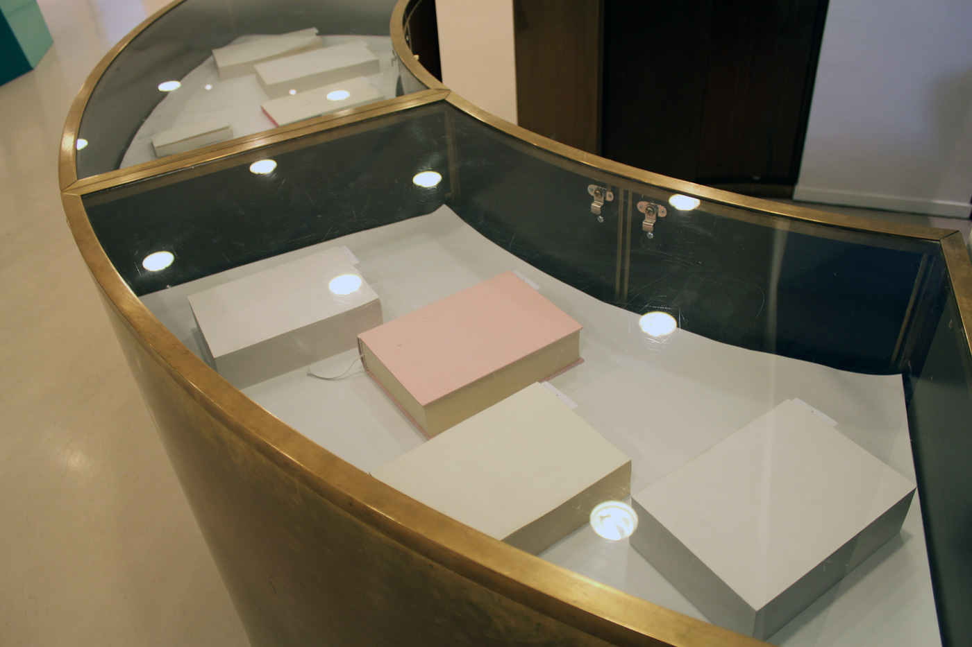
Have You Ever Kissed a Book? John and Jenny Jaskey of the Artist's Institute tried to answer this question and others at the event organised for the exhibition of the Most Beautiful Swiss Books 2015 in London. See our awarded book here.

Jenny Jaskey, director and curator of the Artist's Institute, New York discussed Artists' Institutes at the Kunstakademie Düsseldorf.
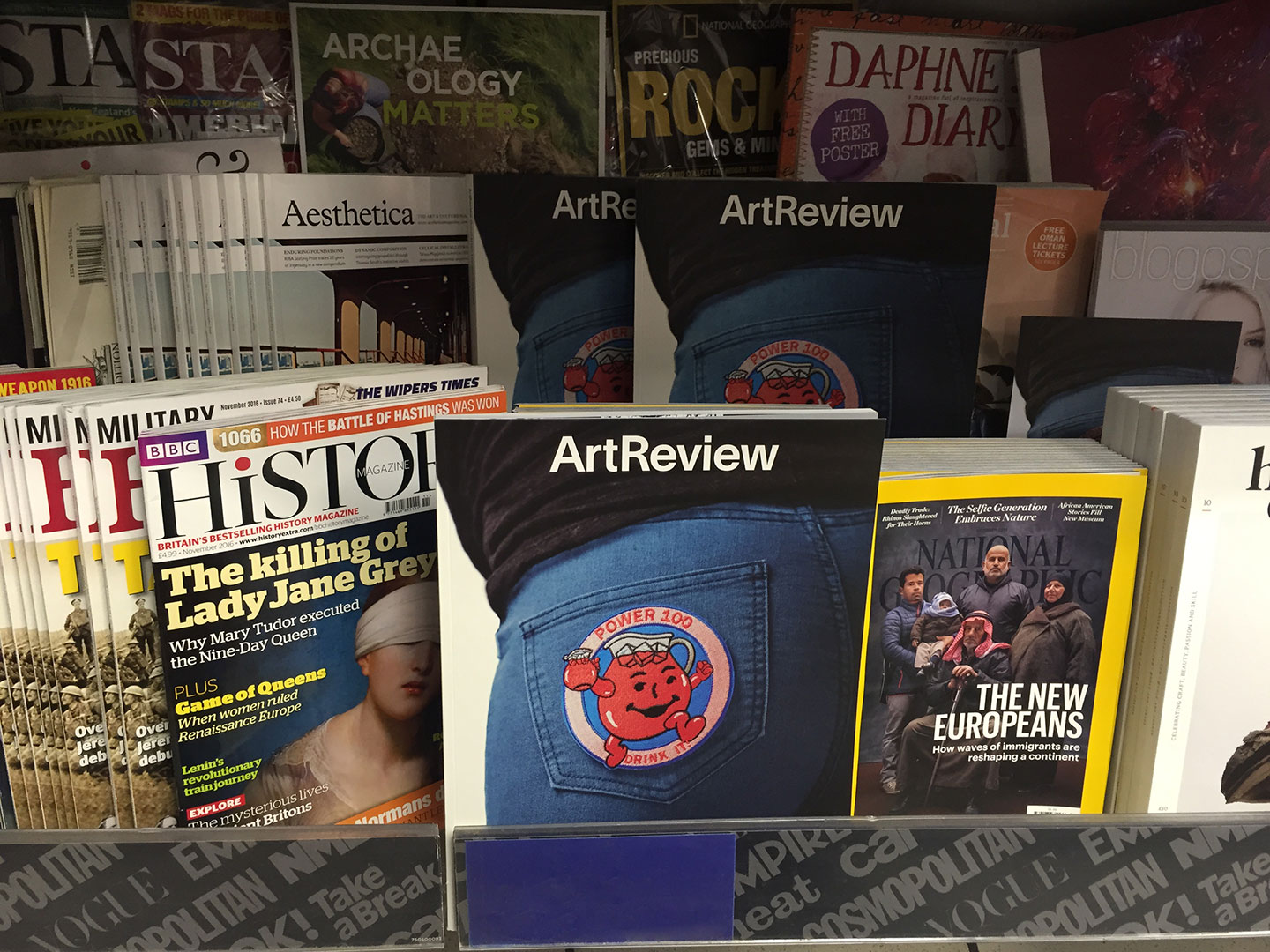
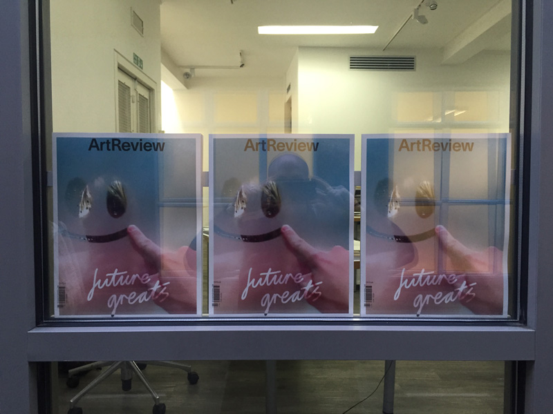
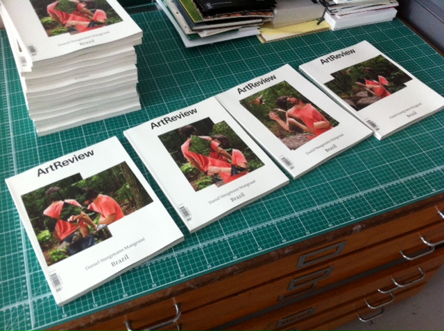
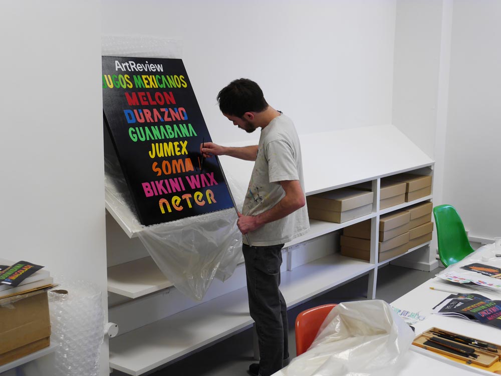
The November issue of ArtReview features the 2016 Power 100, with original artwork by Trevor Paglen and essays on the history of artworld power, international collections and biennial fatigue.
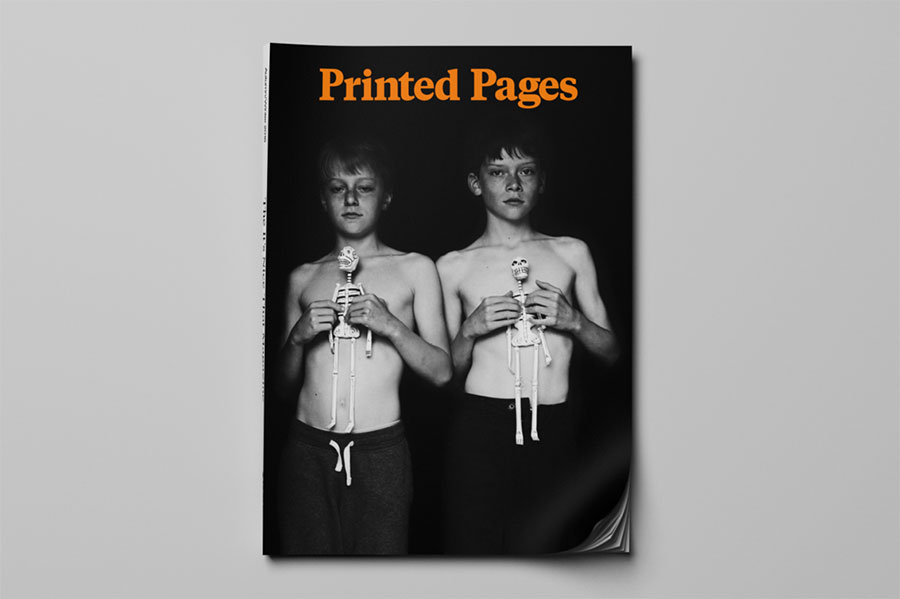
Rudy and Francis (John's sons) on the cover of It's Nice That's Printed Pages AW16. The cover was shot by Jack Davison as part of a commission that profiles John's work.

September 15 – 18, 2016, MoMA/PS1
The Artist's Institute is at New York Art Book Fair for the launch of Carolee's magazine with Carolee Schneemann.
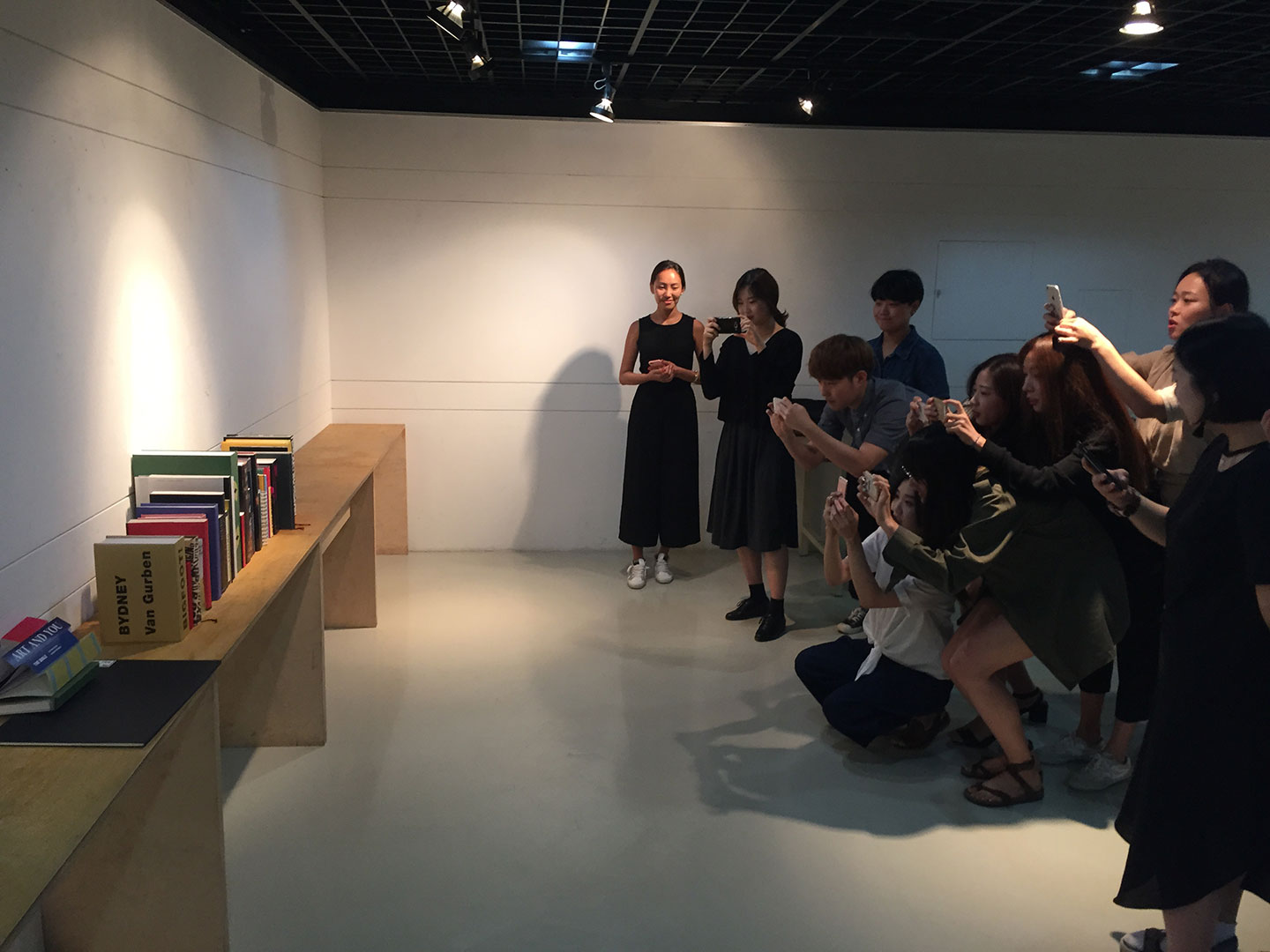
John and students built a fictional library or imaginary books at the University of Seoul, South Korea.

John appointed Professur für Entwurf, Typografie, Buchkunst at the Kunstakademie Düsseldorf.
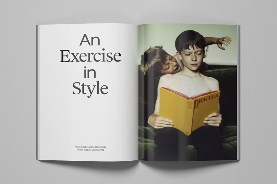
Billie Muraben speaks with John for It's Nice That's, with photos by Jack Davison. Read the article here.
In Oslo, John presented one year of informal, behind the scenes photographs that include inspiration, documentation, workings and failings. Organised by Grafills.
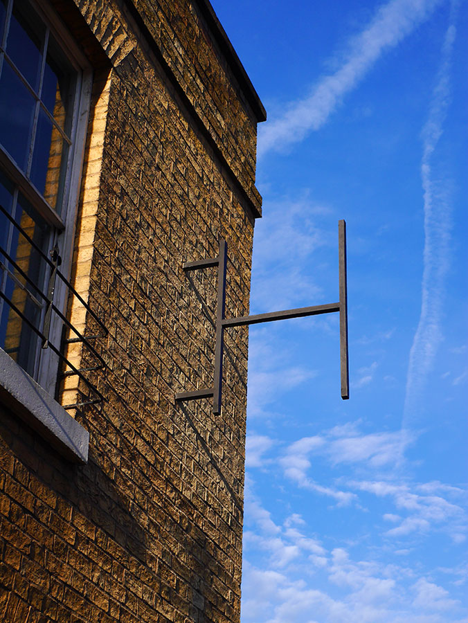
The cast iron H-frame has just been placed and is waiting for its wooden panels to be installed.

French magazine Back Cover invites London based Eye magazine for a series of 4 lectures at Centre Pompidou in Paris with John Morgan, Field, Mark Porter and Kuchar Swara.

Wallpaper's Top 20 Graphic Designers. It's hard to understate the pervading influence of our choices – from John Morgan and Peter Miles (culture and fashion's go-to art directors, respectively), to agency behemoths like Fabien Baron, graphic iconoclast Stefan Sagmeister, M/M Paris, Pentagram partner Paula Scher, North's Sean Perkins and Graphic Thought Facility – even when these practitioners tend to remain relatively anonymous compared to those working in other (glitzier) design disciplines. Read more here
We have designed Edmund de Waal’s latest book and the exhibition graphics for White a project in the Royal Acdemy library. Read more here.

Launch night at The Counting House.

The new Raven Row publication arrived.
Read more here
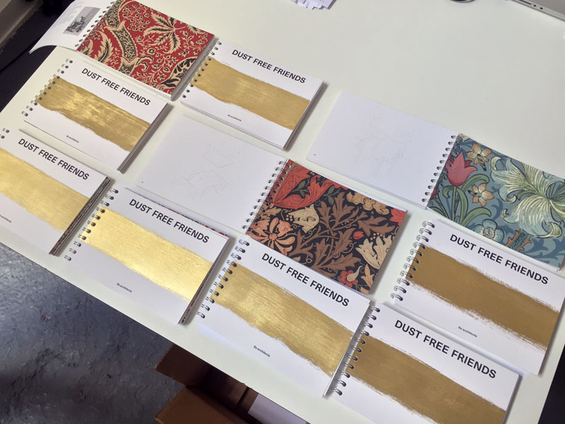
Individually gold brushed cover for 6a architects's Dust Free Friends publication.

On the 27th March, we'll be moving to Somerset House.
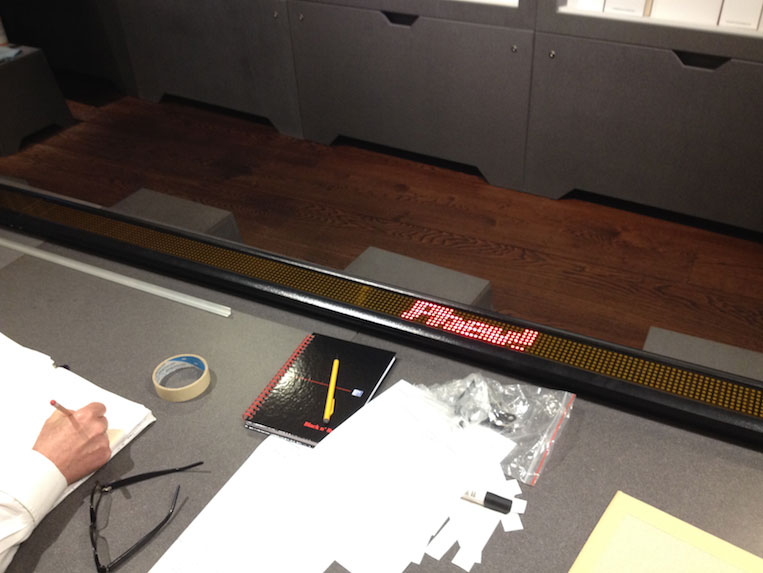
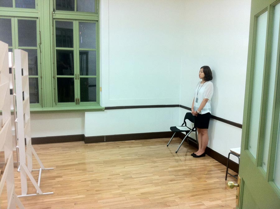
Testing the LED display for Neil Bartlett's contribution to the Institute of Sexology exhibition.
Our typeface Berthe displayed in the exhibition ‘A-t-t-e-n-t-i-o-n’ at the St Etienne Design Biennale.
Art Direction of the 2015 Future Great issue. Artwork by Florian Meisenberg.
Art Direction of 4 covers. Artwork by Daniel Steegman. September 2014.
Go to project


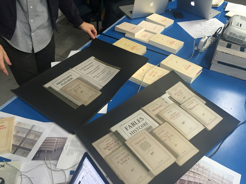
Some Canterbury Tales arrives. The ninth book in the Four Corners Familiars.
Lance Wyman (designer of the Mexico 68 Olympic logo) taking a picture of our signage in Museo Jumex, Mexico City. Thanks to Andy Butler from designboom for the photograph.
Alaric painting the ArtReview cover, Platform 1, Paddington Station.

Inherited remnants of an amateur Dadaist’s Library
The Phoenix Artist Club 6.30-9.30pm

Dieter Rams relaxes with 100 copies of The Prisoner Of Zenda at the Vitsoe 620 Reading Room.


Wood pattern to be used in the founding process.
John was asked to be the UK curator, and select a dozen graphic design projects produced in the UK in 2012 for exhibition in Panorama. Works by Peter MIles, GTF, Jonathan Hares, Margaret Calvert/A2/SW/HK, OKRM, Fuel, Stuart Bailey, Will Holder, James Langdon, 6a architects and Richard Hollis.
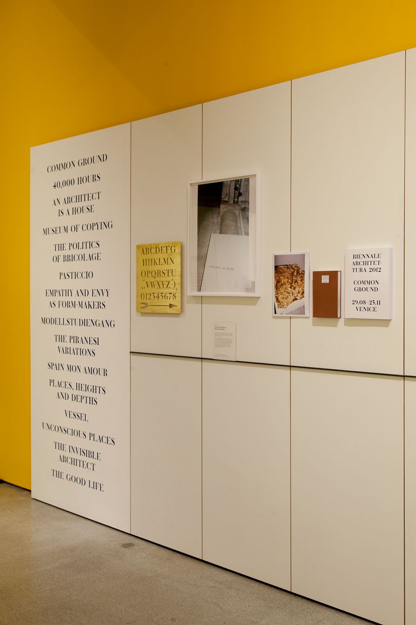
Design Museum installation of Common Ground Venice Biennale graphic identity.
Pleased to annouce that our fourth nomination in the last three years has won the graphic design category. See project page here.
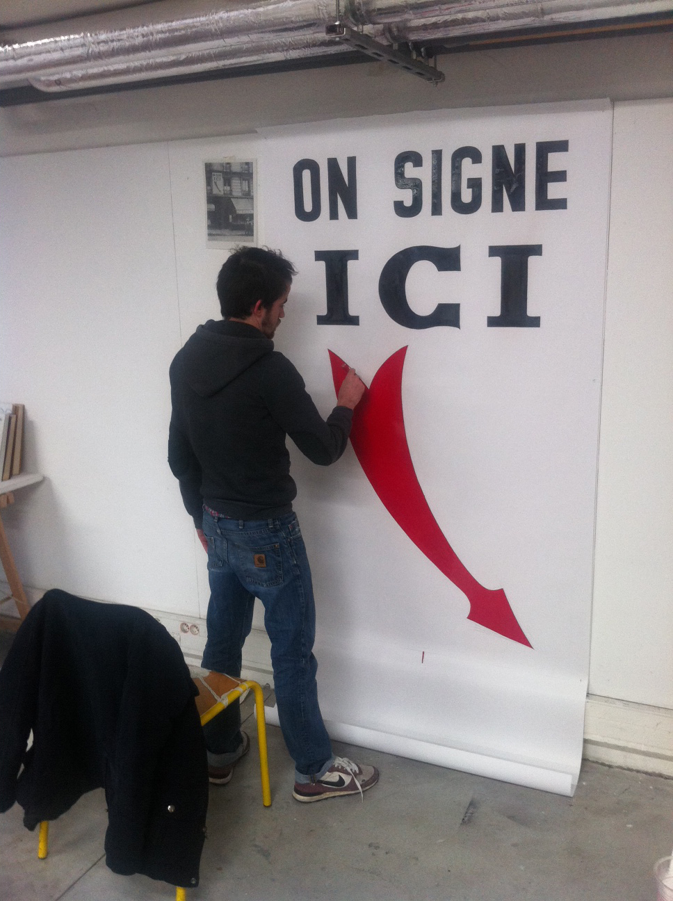
John sets a workshop at the École des beaux-arts de Lyon inspired by Breton's Nadja. Photograph of workshop participant Alaric Garnier recreating a sign from the book.

The Procrustean Bed. A talk by John on small spaces.
Structures. Seminar week. Fribourg, Switzerland.
Invitation from Simon Hartmann, HHF Architekten.
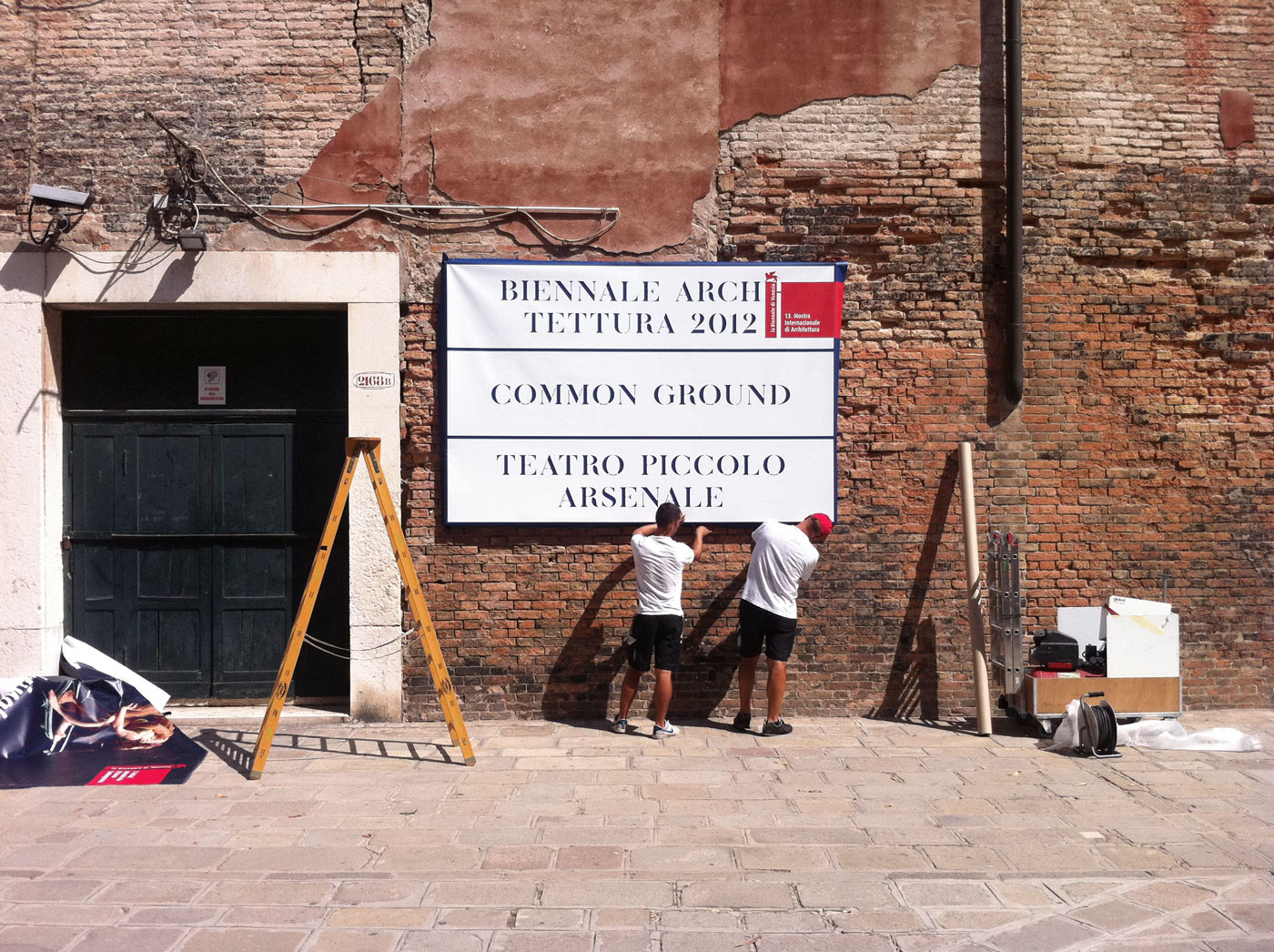
John Morgan explains the thinking behind his visual identity for the 13th Architecture Biennale in Venice (director David Chipperfield).
The Venetian stencil street signs or nizioletti don’t prevent you from getting lost in the labyrinth. But they allow you to get lost in the most elegant way writes John Morgan. Read all on the Eye magazine blog.

Site visit for Fundación / Colección Jumex.
Visit to Luis Barragán designed house Cuadra San Cristobal. Los Clubes.

Exhibition graphics, print campaign and catalogue by John Morgan studio.
Bespoke typeface Banjo for exhibition title and headings seen here behind Karl Lagerfeld and Clare Waight Keller. Go to project page here.
Marcus Campbell Art Books and Four Corners Books are delighted to invite you to the first event in a two-month residency at the shop.
Join us for a talk with designer John Morgan.

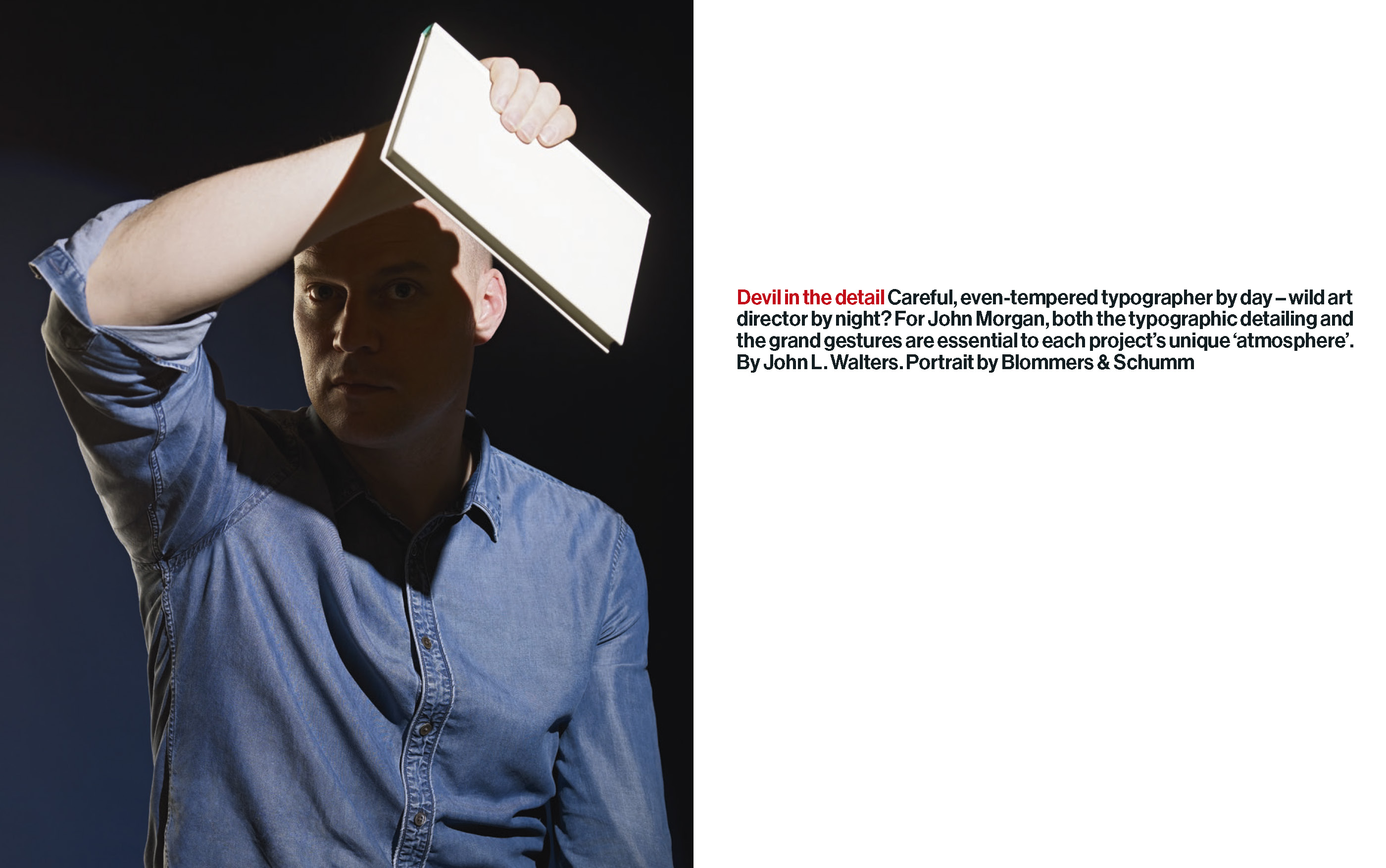
Devil in the detail
Careful, even-tempered typographer by day – wild art director by night? For John Morgan, both the typographic detailing and the grand gestures are essential to each project’s unique ‘atmosphere’. By John L. Walters.
http://www.eyemagazine.com/feature/article/devil-in-the-detail

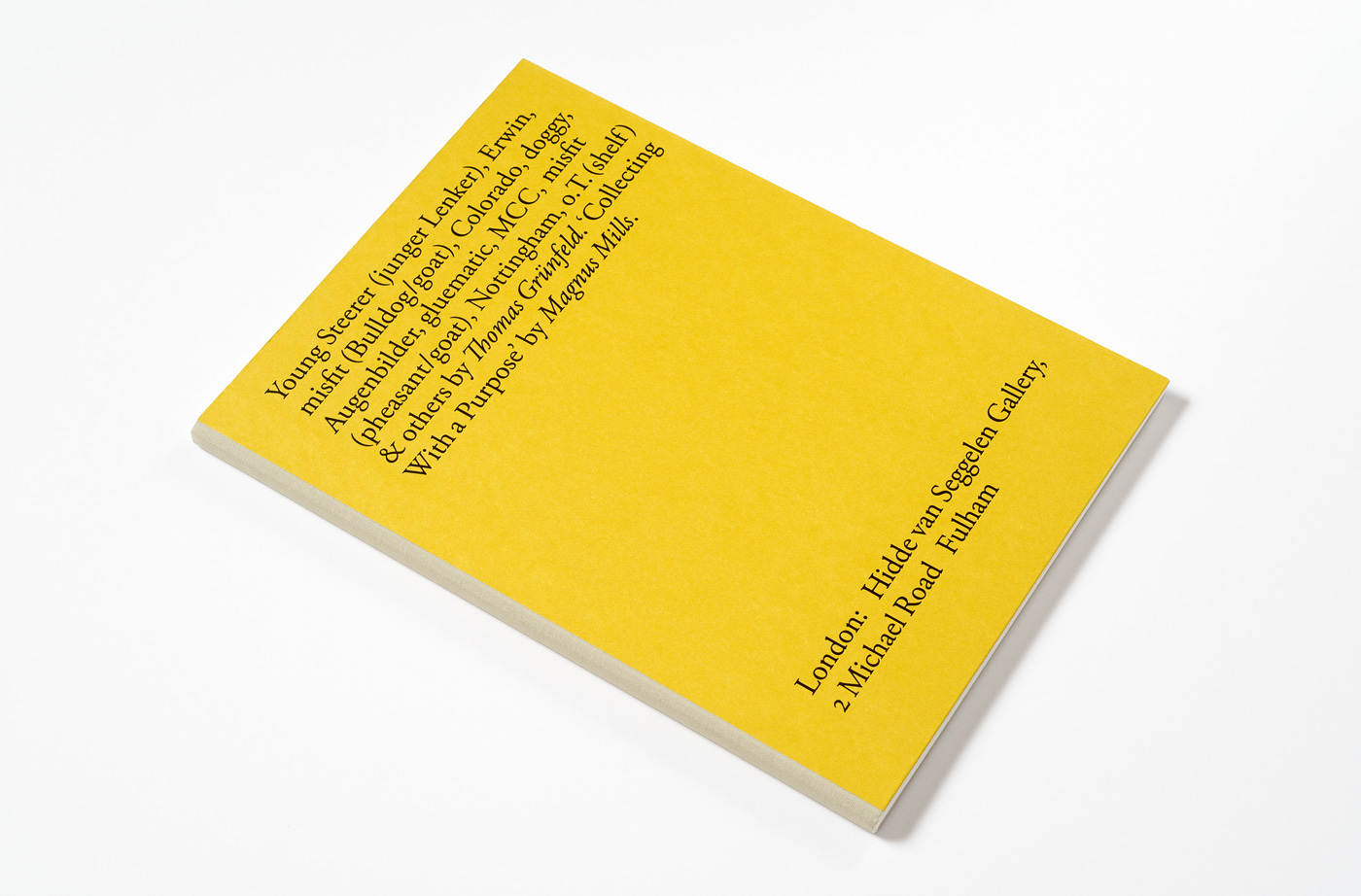
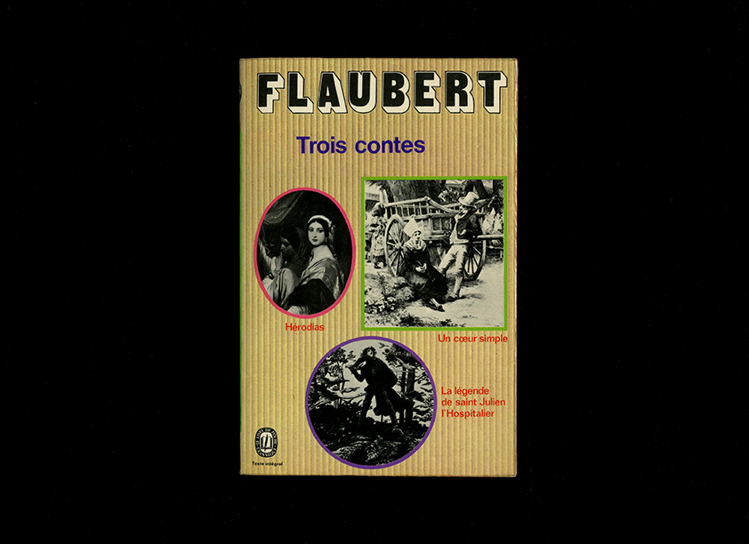
The Stiftung Buchkunst (Book Art Foundation) has announced Young Steerer as one of the 25 best German books 2012
The jury’s comment:
“More is better”, is one of the empirical laws that are rarely examined for their content. The opposite of “Good” is “Low”, but the modesty in the use of funds must not utter a modest book. And “Young Steerer” shows us that.
To make small, is not an issue here: Large images are available, and large print. But the diversity of what was here collected and gathered in the book, is dressed in the simplest form: full and half-page illustrations, which split up with a single font in a single font size, the double-page spreads. Even title pages, notes and imprint us confront the same extent and arrange themselves so that the strict, straight course under. But can one speak of subordination, but where every element comes to his voice and his right? And why should those elements that were involved in this beautiful object, hide small? No, they should be praised and honored.

4 May – 24 June, Selfridges UltraLounge exhibition.
A series of seven installations take as their inspiration three issues of Vogue. Exhibition design by Judith Clark. Exhibition graphics by John Morgan studio. Image above shows rain made with painted metal bars.
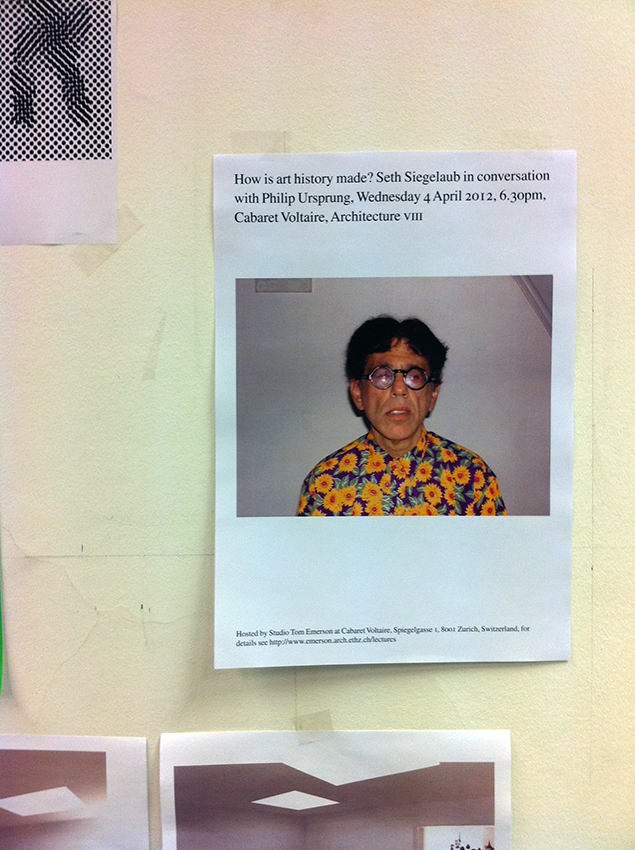
with Philip Ursprung, Wednesday 4 April 2012, Cabaret Voltaire (poster by the studio for Studio Tom Emerson, ETH Zurich).

The poster we designed for the Saul Bass exhibition in 2004 has been included in this exhibition at the Design Museum, London. 'The posters shown here are some of the best Design Museum posters and from our most significant exhibitions. They range from the very first, 'Commerce and Culture' (1989), to our most visited, 'Manolo Blahnik' (2003). The posters are displayed in the cafe and continue up through the central stairwell.' See Saul Bass project page.
We have been nominated for the 2nd year in a row (last year for Four Corners Familiars series). The Design Museum’s Design Awards, ‘the Oscars of the design world’, showcase the most innovative and progressive designs from around the world, spanning seven categories: Architecture, Digital, Fashion, Furniture, Graphics, Product and Transport.
Photo: Anja Schaffner
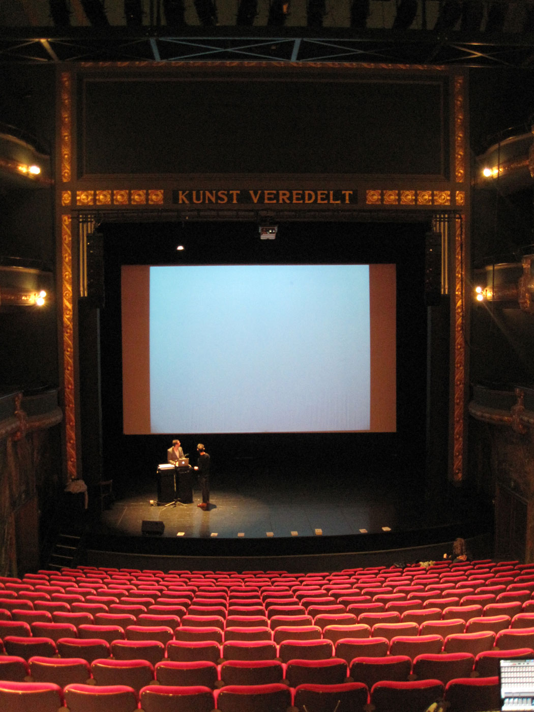
John speaks about a book he can't read at this event.
'The awarded books become part of an exhibition which travels to various cities around the world. When the books stop off in London, they will be the subject of discussion at ‘Thoughts on a Book’, an evening of talks. Each speaker has chosen a book to present. They will hold a 10 minute presentation about their experience of reading that particular book. Speakers: Brian Dillon, Will Holder, Stewart Home, Justin McGuirk, John Morgan, Pieternel Vermoortel. Chaired by David Crowley. Organised by Kellenberger-White and Hana Tanimura.'
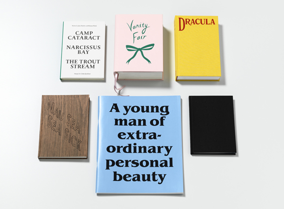
The Four Corners Familiars books designed by the studio are featured in this exhibition. See the covers for The Picture of Dorian Gray and Dracula on the jacket of the accompanying publication.
Tour Schedule: Walker Art Center, Minneapolis, October 22, 2011–January 22, 2012. Cooper-Hewitt, National Design Museum, Governors Island, New York, May 26–September 2, 2012. Hammer Museum, Los Angeles, September 30, 2012–January 6, 2013. Contemporary Arts Museum Houston, Texas, July 19–September 29, 2013. Southeastern Center for Contemporary Art (SECCA), Winston-Salem, North Carolina, October 24, 2013–February 24, 2014.
This major international exhibition explores how graphic design has broadened its reach dramatically over the past decade, expanding from a specialized profession to a widely deployed tool. With the rise of user-generated content and new creative software, along with innovations in publishing and distribution systems, people outside the field are mobilizing the techniques and processes of design to create and publish visual media. At the same time, designers are becoming producers: authors, publishers, instigators, and entrepreneurs employing their creative skills as makers of content and shapers of experiences. A comprehensive, illustrated catalogue produced by the Walker accompanies the exhibition.

Other new UK members: Adrian Shaughnessy, Bibliothéque: Jon, Mason & Tim, Frith Kerr, Jeremy Leslie and Peter Saville.
The last printed issue of Things magazine. See project page.
A wall of blank dummies made for studio projects: 'The graphic designer and typographer John Morgan will display a selection of publications, highlighting the material side of bookdesign, an aspect of books rarely discussed. John Morgan will also give a talk about his work with the Four Corners Familiars series that features artists’ responses to classic novels and short stories. Each book is different in style and format, according to the needs of the artwork and the text. Six titles have now been completed, with more being prepared.'
The Design Museum’s Design Awards, ‘the Oscars of the design world’, showcase the most innovative and progressive designs from around the world, spanning seven categories: Architecture, Digital, Fashion, Furniture, Graphics, Product and Transport.
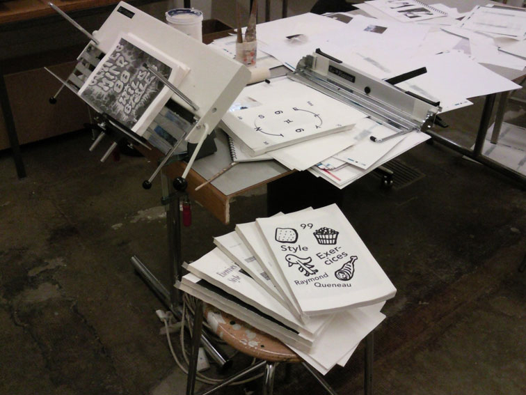
John Morgan workshop at ECAL, Lausanne. 22.11.10 – 26.11.10. Exercises in style / Exercices de style. Raymond Queneau. Objectives: An attempt to work through design cliches, parodies, pastiche, genres, to approach some idea of 'truth' or 'honesty'. To get these out of the system, to 'get rid of the scabs' as Queneau says, ‘In Les Exercises de Style I started from a real incident, and in the first place I told it 12 times in different ways. Then a year later I did it another 12, and finally there were 99. People have tried to see it as an attempt to demolish literature – this was not at all my intention. In any case my intention was merely to produce some exercises; the finished product may possibly act as a kind of rust-remover to literature, help to rid it of some of its scabs.’ (Queneau, conversation with Ribemont-Dessaignes).
‘There are no gustatory or olfactory alphabets (alphabeti-spagetti). The gourmet is not provided for in this respect; all the same it is diverting to consider some possibilities: it is a question of arranging gustatory components into a system like sounds. Then a learnable connection would have to be found between them – like that between sounds and visual signs: the newspaper might be thought of as a speech tablet to be dissolved slowly in the mouth.’ (Gerstner, Compendium for Literates).
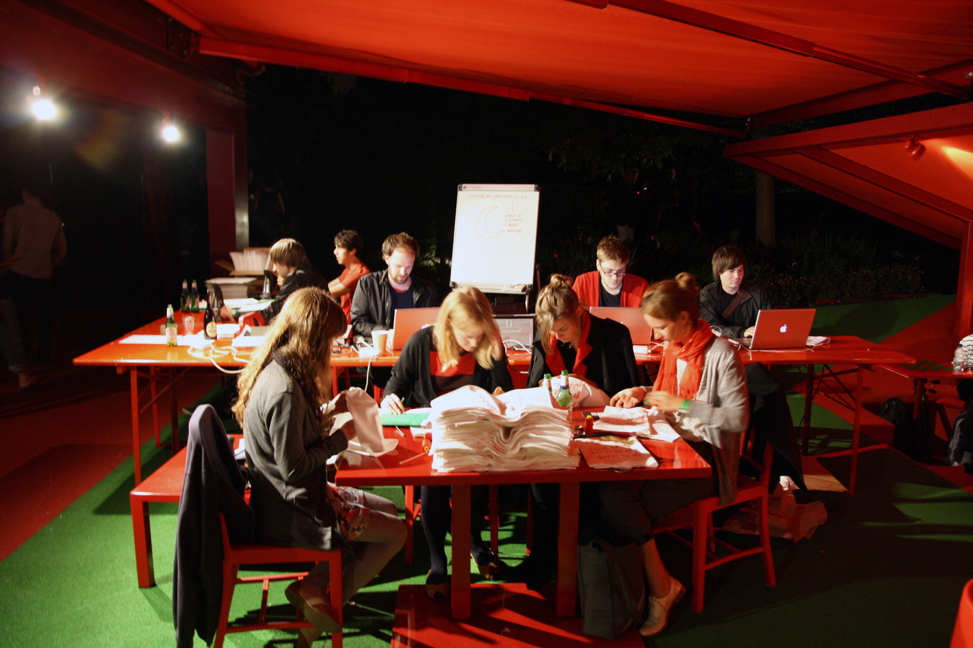
We moved the studio to the Serpentine Pavilion and made a book 'Go to Sleep' in one night.
'The Serpentine Gallery and the V&A stage a unique overnight event of talks, films, experiments and a midnight feast in the Serpentine Gallery Pavilion 2010 designed by Jean Nouvel. Artists, architects and musicians amongst others will host activities throughout the night, exploring ideas of mapping sleep and the psychedelic qualities of insomnia.' Go to project.

William Firebrace, Tom Weaver and Roger Excoffon.
Photograph: Lionel Catelan
8pm, De Verdieping, TrouwAmsterdam.
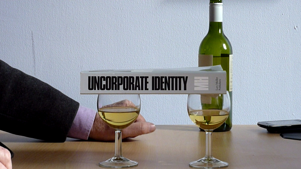
We made a short video with David Greene (Of the Invisible University and Archigram) and music from Laibach for John's talk at the launch of Uncorporate Identity by Metahaven.
'A festive symposium will accompany the book launch of Uncorporate Identity by Metahaven. Swiss publisher Lars Müller, London-based design collective Brave New Alps, British designer John Morgan, and architecture historian and urbanist Wouter Vanstiphout will join the debate, together with theorist Marina Vishmidt and designers Vinca Kruk and Daniel van der Velden of Metahaven. In a series of provocative short lectures, the speakers will react to the book and its overall theme. A compendium of ideas and a source for debate, Uncorporate Identity is an ambitious collection of design projects around visual identity and politics. It presents the visual projects and writings of design studio Metahaven along with a host of contributing writers. Organized as a sequence of five chapters, each comprising case studies, notes and essays, it explores, visually and textually, the paradoxes of identity in a networked world.'
Saint-Lucas Visual Arts Ghent presents an entire day related to graphic design with lectures by: David Bennewith, Mirko Borsche, John Morgan, Walter Nikkels, Samuel Nyholm & Ola Persson. Kunstencentrum Vooruit, Theaterzaal, Sint-Pietersnieuwstraat 23, 9000 Gent.
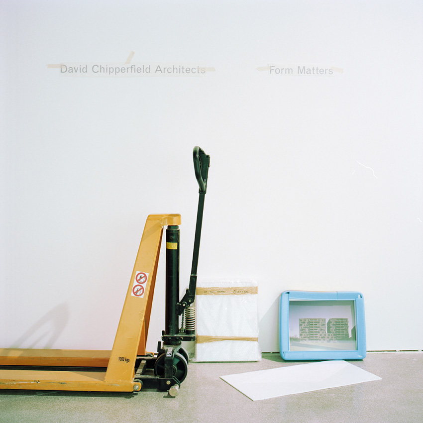
‘Form Matters’ is a cerebral blockbuster that relies not on lurid hypergraphics (instead using designer John Morgan’s characteristic restraint) or exuberantly curved cabinets and forms, but rather the pleasure that comes from wandering through a cityscape, scattered with models of varying sizes and materials. The structure of the exhibition is created by a series of large white panels, bearing painstakingly applied vinyl line drawings of 18 signature projects, stripping out the excesses of modern architectural presentation (renders are refreshingly thin on the ground throughout) and reducing each building to its Platonic ideal.’ (Wallpaper online October 2009). See project page.
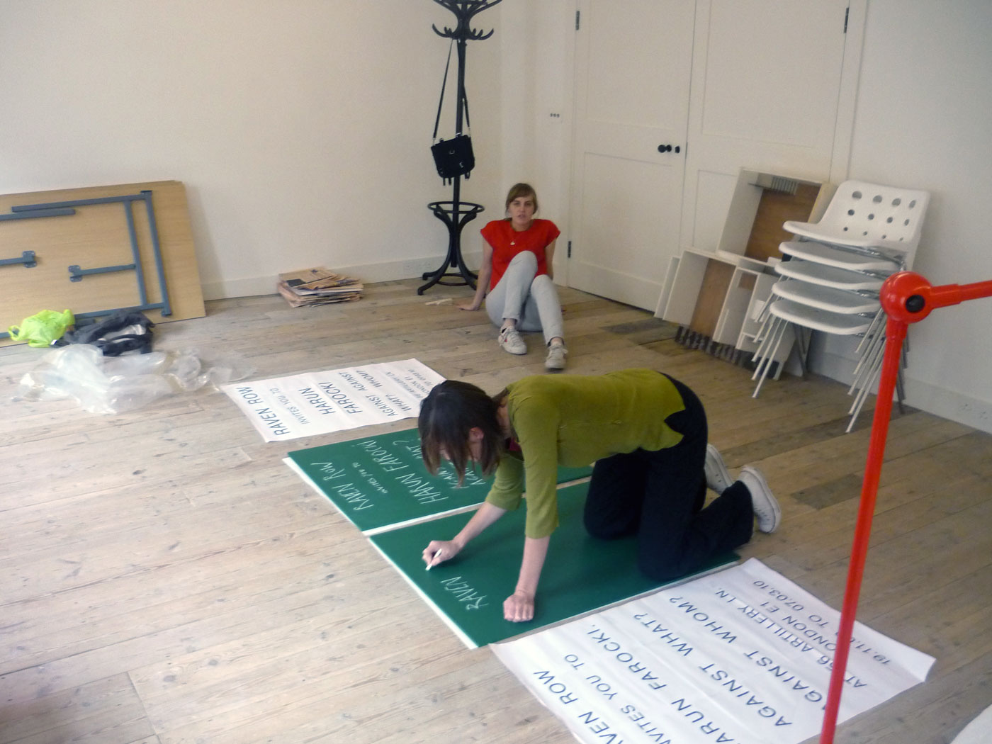
Making the Farocki sign. A green chalkboard. Alice and Sue from Raven Row. Go to project page.
17 July to 10 October 2004, Design Museum, London. See project page.